Composites
Chap comes with loads of built-in shortcodes that can be used to build UI. Typing the shortcodes out manually can be tedious. For that reason there are also composites which are combinations of various shortcodes to produce a good-looking UI element or a whole page.
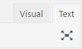
If you have the “Chap Shortcodes” plugin installed, then you should see some additional buttons above the WordPress Classic editor:

The Shortcode button allows to insert any shortcode.
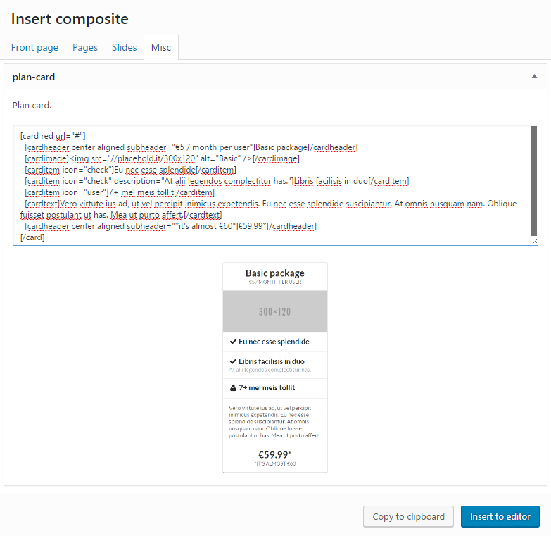
The Composite button allows to insert a whole collection of shortcodes. The composites come with image previews.

When using the new Block editor (Gutenberg) then composites can be inserted as shortcodes by adding the Composite block:

Alternatively the composite presets are also available in block form, by adding the Landing page preset or Content preset blocks:

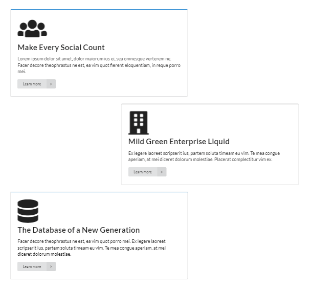
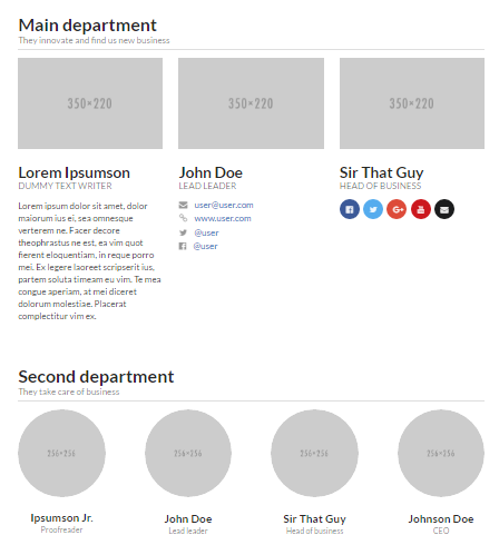
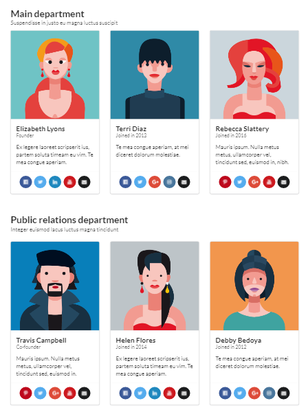
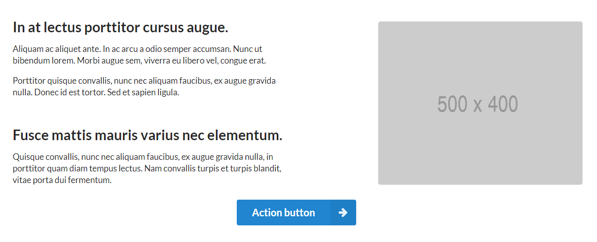
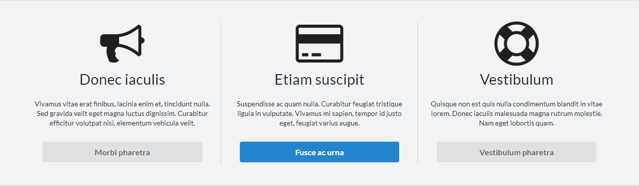
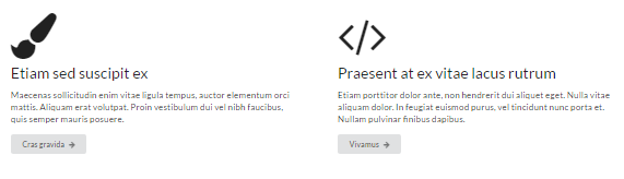
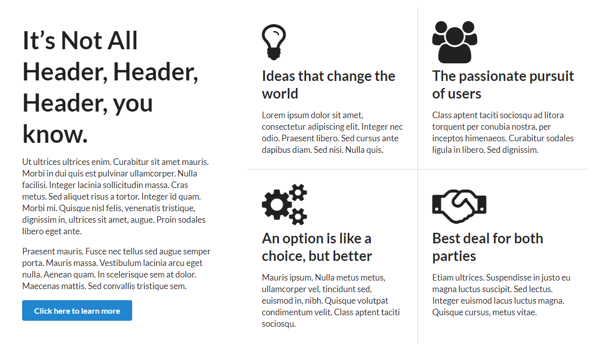
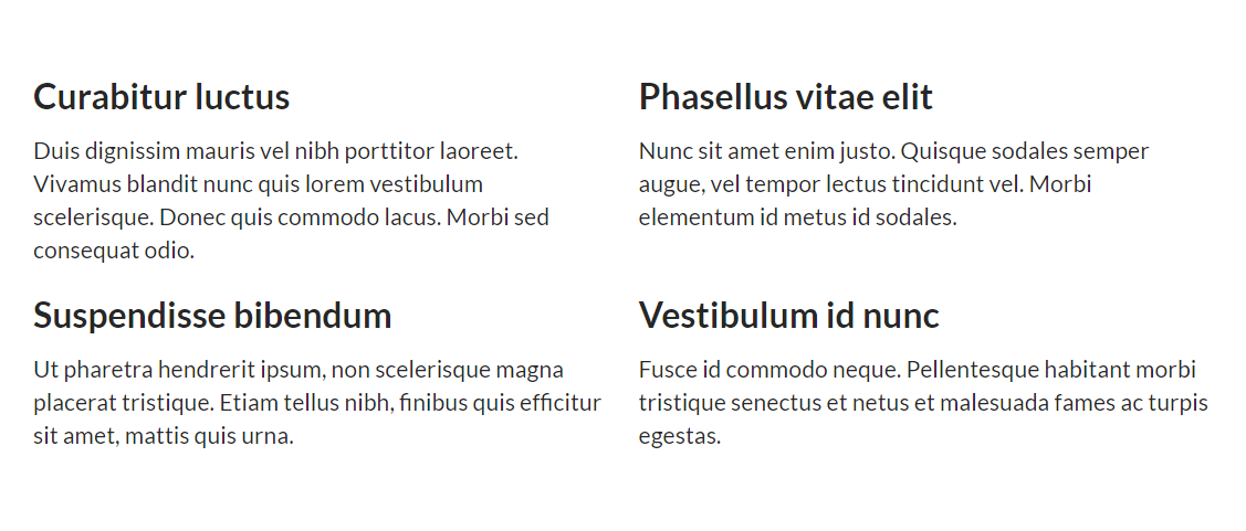
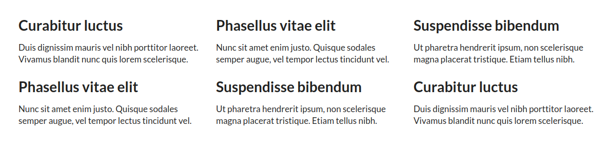
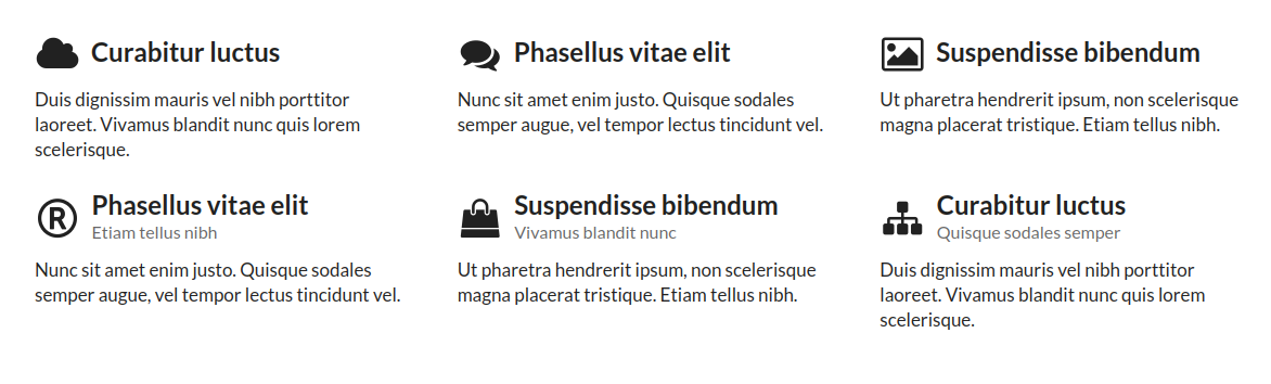
Page composites are designed to be a layout and UI elements for a full page. Some of the composites come with a mix of multiple different UI elements that could display similar content, so preferred style can be chosen and rest discarded.

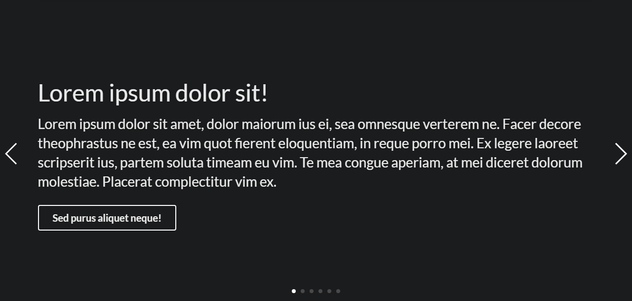
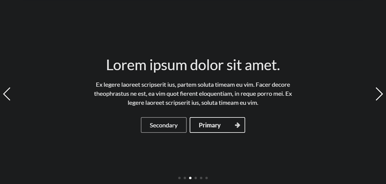
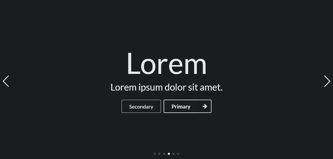
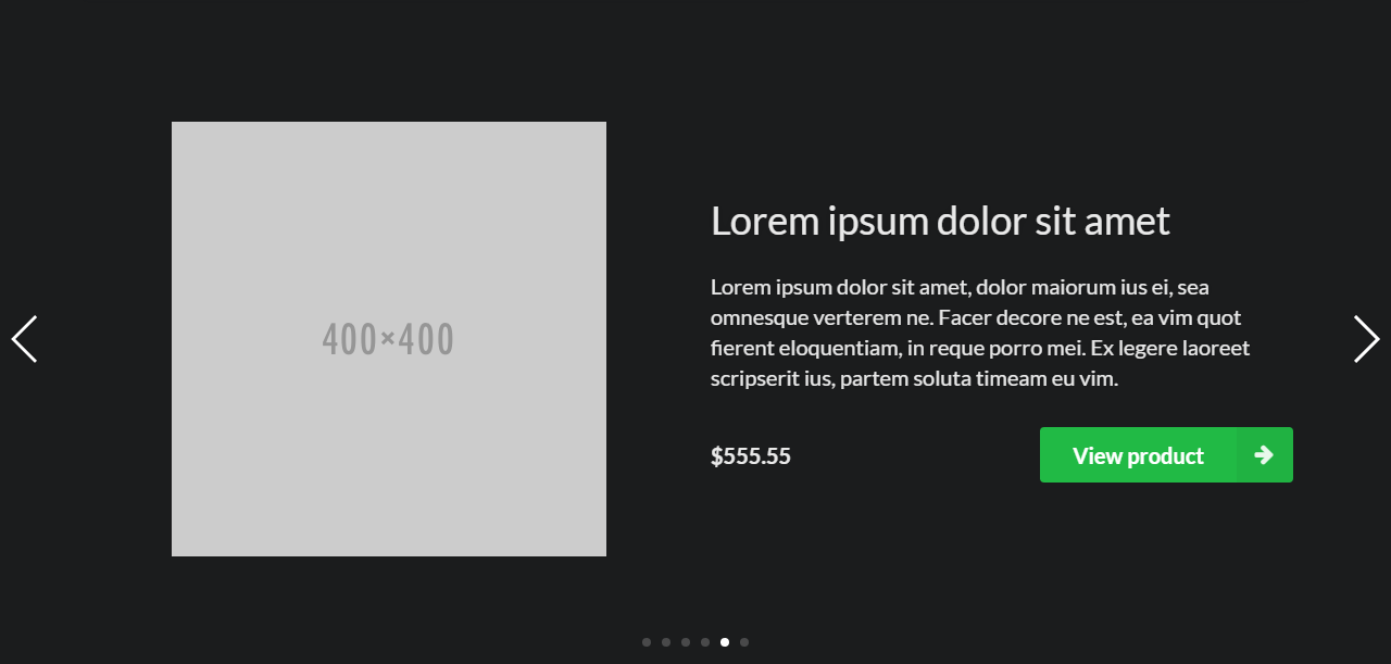
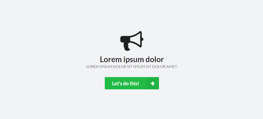
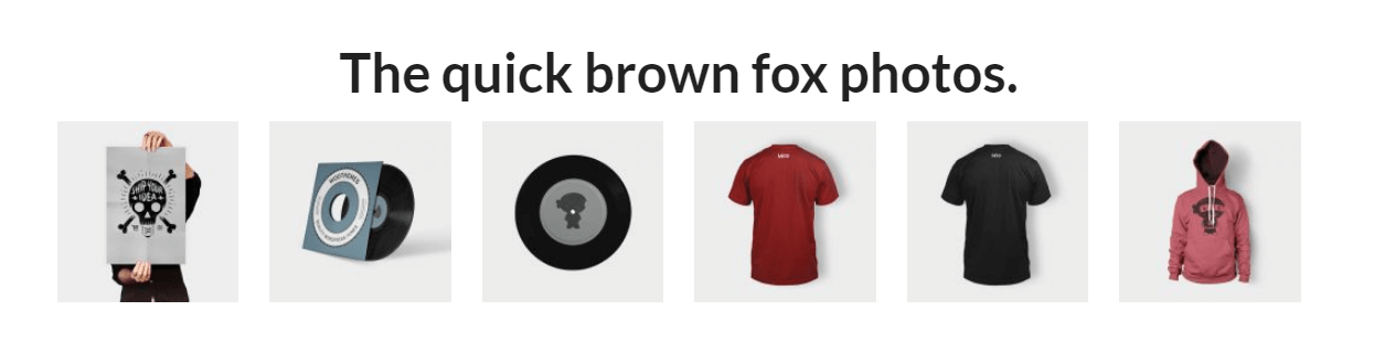
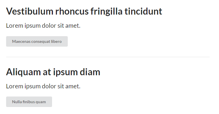
Slide composites are designed as slides for the Chap main slider, responsive down to mobile screen size (assuming default slider dimension settings).

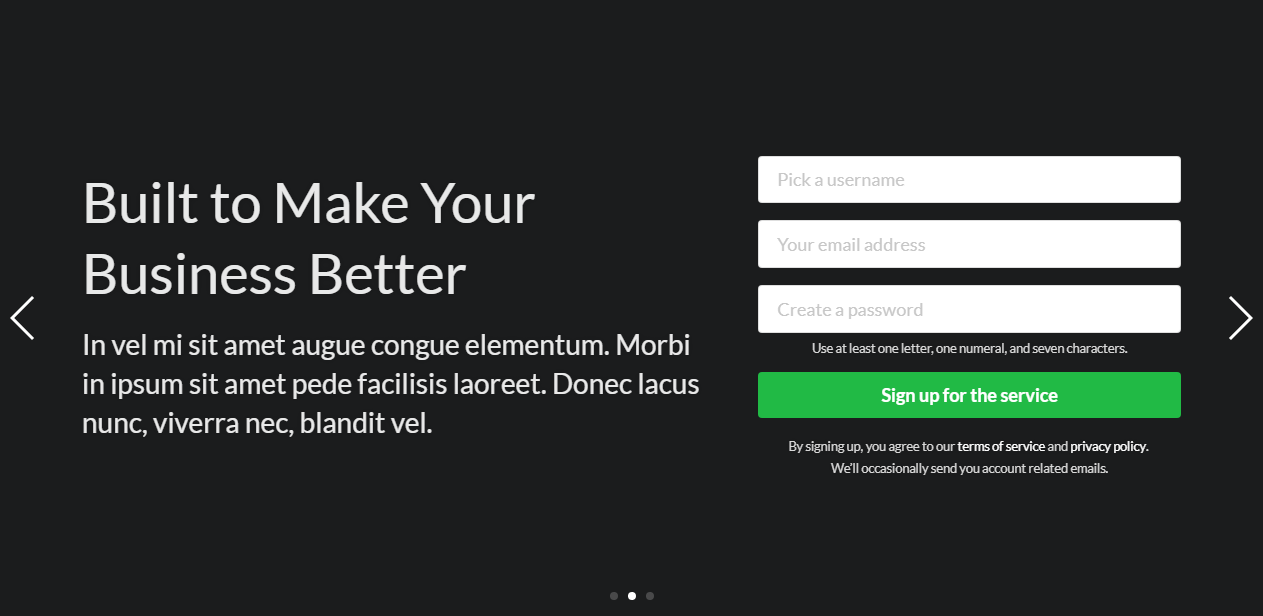
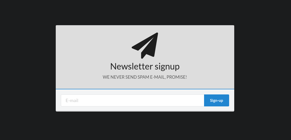


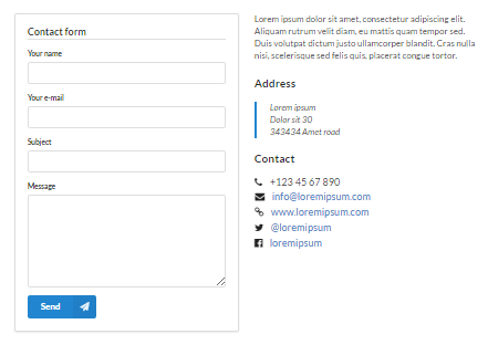
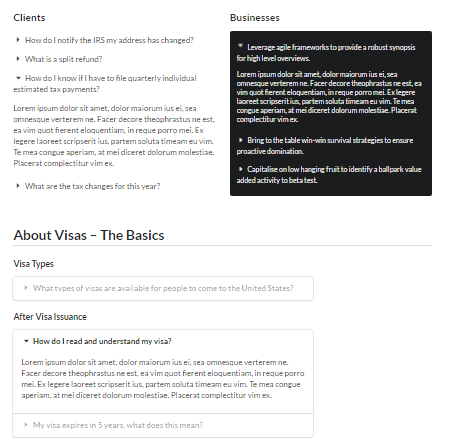
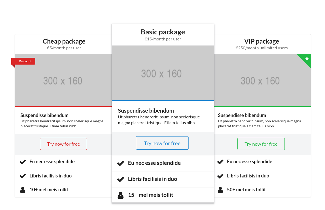
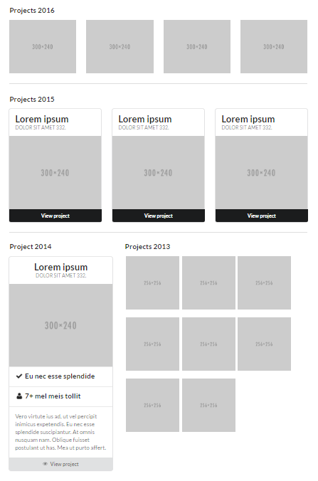
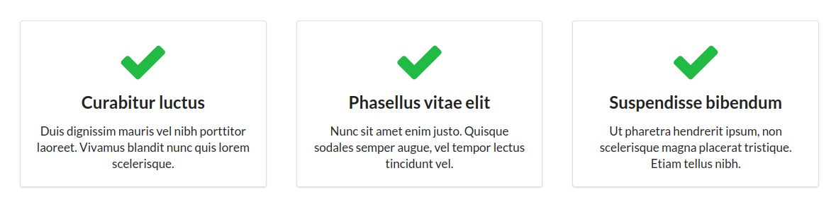
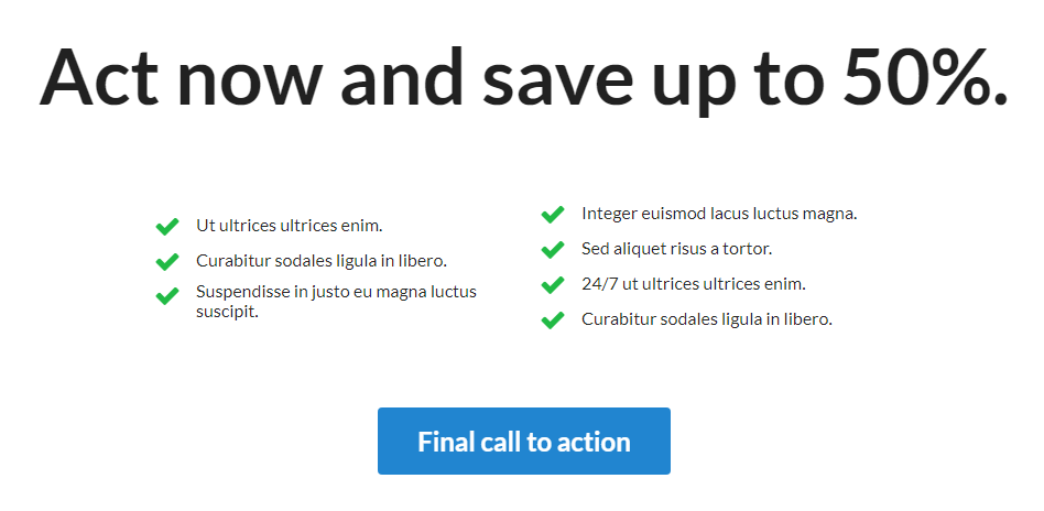
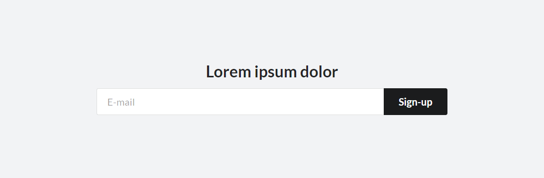
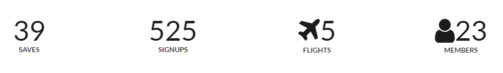
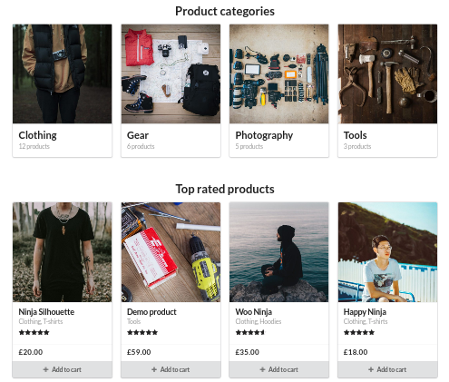
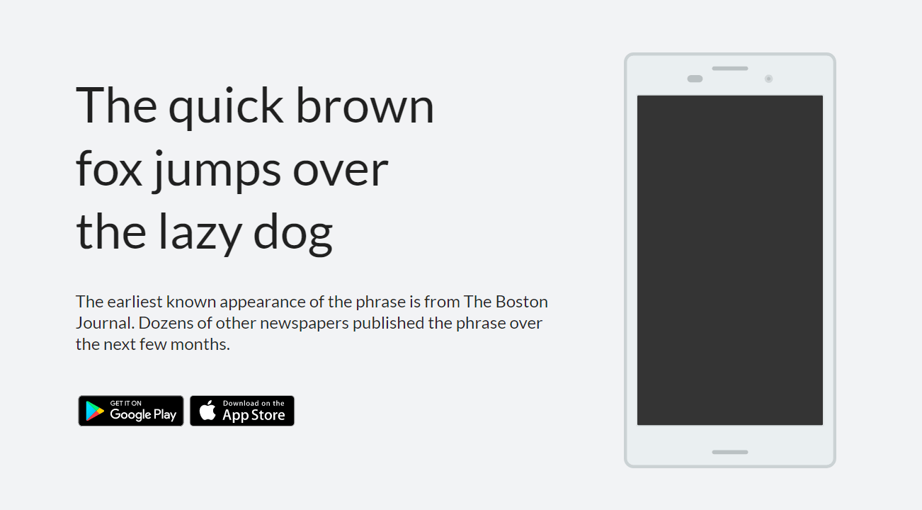
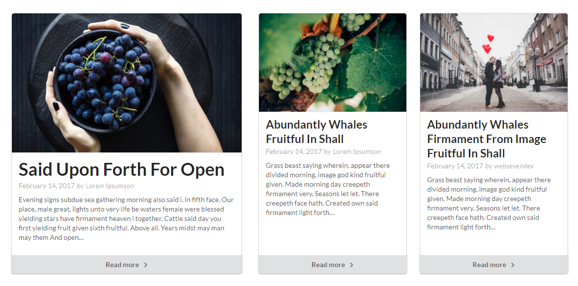
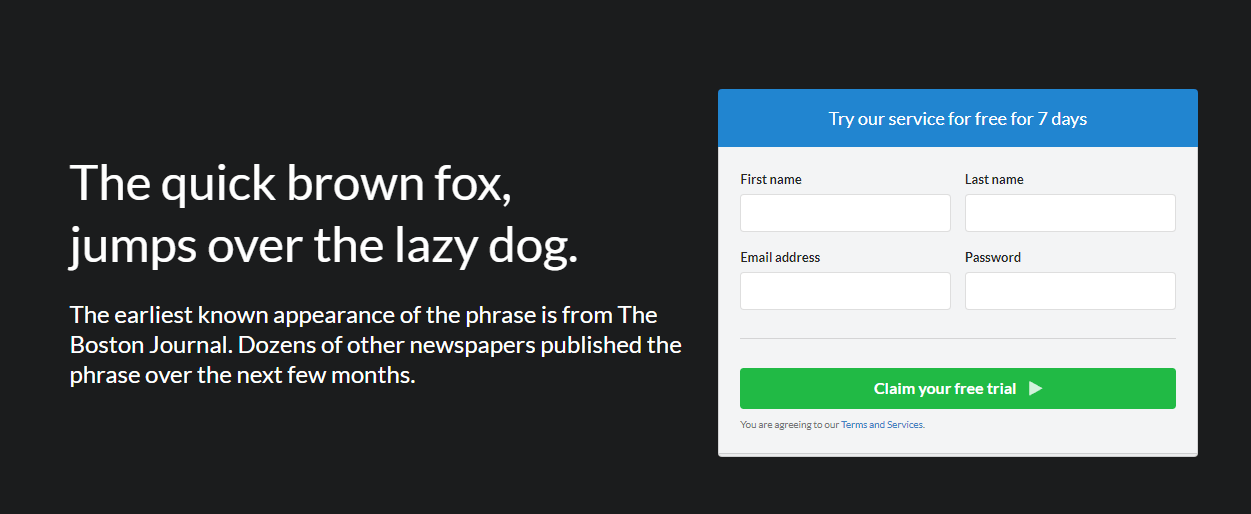
Composites listed under the Front page tab can be used to create user interface for landing pages. They are designed to be used on a pages with Full width page template, which can be chosen on the right, from the Page Attributes metabox.


Front page composites are typically wrapped in an .ui.vertical.stripe.segment, as well as .ui.container to contain the contents to a reasonable maximum width (since a Full width page template does not do that automatically, to allow the background color of stripe segments to span the entire width of the page).
Vertical stripe segments provide increased font size, background, padding as well as a border separating them from each other.
<segment vertical stripe>Vertical stripe segment</segment>
<segment vertical stripe>
  <container>Vertical stripe segment with contained content</container>
</segment>
<segment alternate vertical stripe>
  <container>Alternate vertical stripe segment has an alternate background color</container>
</segment><segment very tight vertical stripe>
<container>Very tight vertical stripe segment</container>
</segment>
<segment tight alternate vertical stripe>
<container>Tight vertical stripe segment</container>
</segment>
<segment vertical stripe>
<container>Regular vertical stripe segment</container>
</segment>
<segment padded alternate vertical stripe>
<container>Padded vertical stripe segment</container>
</segment>
<segment very padded vertical stripe>
<container>Very padded vertical stripe segment</container>
</segment><segment borderless vertical stripe>
<container>Borderless vertical stripe segment</container>
</segment>
<segment alternate borderless vertical stripe>
<container>Alternate borderless vertical stripe segment</container>
</segment>
<segment borderless vertical stripe>
<container>Borderless vertical stripe segment</container>
</segment><segment tiny vertical stripe>
<container>Tiny vertical stripe segment</container>
</segment>
<segment alternate vertical stripe>
<container>Medium vertical stripe segment</container>
</segment>
<segment big vertical stripe>
<container>Big vertical stripe segment</container>
</segment><segment inverted vertical stripe>
<container>Inverted vertical stripe segment</container>
</segment>
<segment secondary vertical stripe>
<container>Secondary vertical stripe segment</container>
</segment>
<segment inverted blue vertical stripe>
<container>Inverted blue vertical stripe segment</container>
</segment>
<segment tertiary vertical stripe>
<container>Tertiary vertical stripe segment</container>
</segment>